
In my preliminary task the images I used were poorly constructed and poorly planned. My audience was very generalised for my preliminary task (students), so the photo’s I took had to incorporate all aspects of college life. I didn’t think of the composition of my photos when I took them, causing them to gain a slightly haphazard look. For my main task I could chose my target audience, so therefore I had a lot more photographic freedom. This also caused me to plan my photographs more thoroughly. The lack of planning in my preliminary task taught me that to achieve the best end product I would have to think a lot more about composition, lighting and even camera angle.

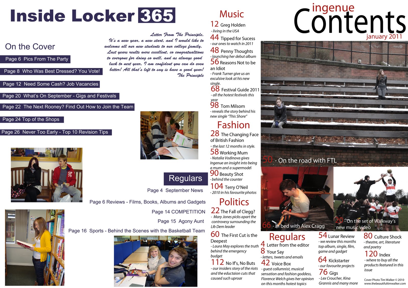
I used various editing techniques to change the mood of the images, for example with the image on the bleachers I changed the saturation and the lighting to give the image the slightly washed out appearance. I also used this to make the red on the shirts of the rugby image duller and less vivid, as I found the brightness of the red drew too much attention away from the muted red text.
 For the preliminary task I had very minimal knowledge of Photoshop, so I left all the images basically unedited (expect for some resizing). I was much more confident for my main task, and learnt how to accurately use the quick section tool to cut out the models head from the background.
  I also used the clone stamp tool in my main task image to erase bra straps and to intensify the colour of the lips. This has added greatly to the image, and made it appear a lot more professional.
 I also learnt how to best utilise the ruler tool in Photoshop to give clear lines to my text. I did not have this skill in the preliminary task, and the wonky text is especially noticeable on the contents page. This was the kind of attention to detail that I lacked on the design of my preliminary task.
 After consideration I chose to retain the font I used on the preliminary task. This was because I felt it suited the understated, minimalistic and uncluttered feel of the magazine, whilst still being easy to read.
The cover lines on my original task used question marks, exclamation marks and capital letters in the style of a gossip magazine, such as “Chat!” or “Ok!” magazine. Whilst that style would appeal to somebody looking for some light reading with not too serious information I understood that for my music magazine my target audience would not be taken in with shouty cover lines, and would instead be more interested in the actual content.

As I did not produce a double page spread for my preliminary task I used articles in magazines such as Rolling Stone, Q and Vogue to gain inspiration for a suitable house-style for my magazine. This also developed my journalistic skill. I asked members of my target audience to read my double page spread to see if they felt it was appropriate for the magazine and to see if it interested them.
No comments:
Post a Comment